

Brand Kit




Clearspace
To ensure the ØG logo remains clear and legible in all uses, there needs to be clear space surrounding the logo that should be kept free from other design elements and other visual elements, such as text, images, or other graphics.

Logo Misuse
To maintain consistency in the logo usage, do not do any of the following with the logo:
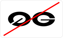
Do not stretch or deform the logo, modify spacing or elements.

Do not use unapproved colors or add drop shadows.

Do not rotate or change the logo orientation.
Base Colour
The majority of UI design utilizes the base colors from backgrounds, text, dividers etc. Opacities of black and white are used to create depths and hierarchy
Primary
The primary color is ultimately your ‘staple’ Brand color, it is used across all elements of a UI including buttons, borders, fills and many other areas.
Regola Pro
Medium
Regular
Book
ABCDEFGHIJKLMNOPQRSTUVWXYZ
abcdefghijklmnopqrstuvwxyz
0123456789 !@#$%^&*()
Geist Mono
Medium
ABCDEFGHIJKLMNOPQRSTUVWXYZ
abcdefghijklmnopqrstuvwxyz
0123456789 !@#$%^&*()